For the second edition of little red comma, Tusitala was commissioned by Esplanade – Theatres on the Bay to create digital adaptations of seven literary works, by established and emerging homegrown writers as well as literary pioneers.
A work was released on the Esplanade Offstage platform every month from the end of August 2022 to February 2023. Each work featured original soundscapes, audio readings and illustrations by local artists and creatives.
Objectives
- Ignite interest in Singapore literary fiction using the dynamic and interactive properties of digital media.
- Encourage discovery and appreciation of homegrown fiction and Singapore’s literary heritage among Singaporeans and an international audience.
We wanted to appeal to the following audiences:
- Those already interested in reading and are between the ages 13 and 24
- Those with little interest in homegrown fiction and/or no awareness of Singapore’s literary arts scene.
- International readers who are interested in literary arts
Ideation
We proposed using four different formats to present the seven works which were chosen for their focus on actual spaces in and of Singapore:
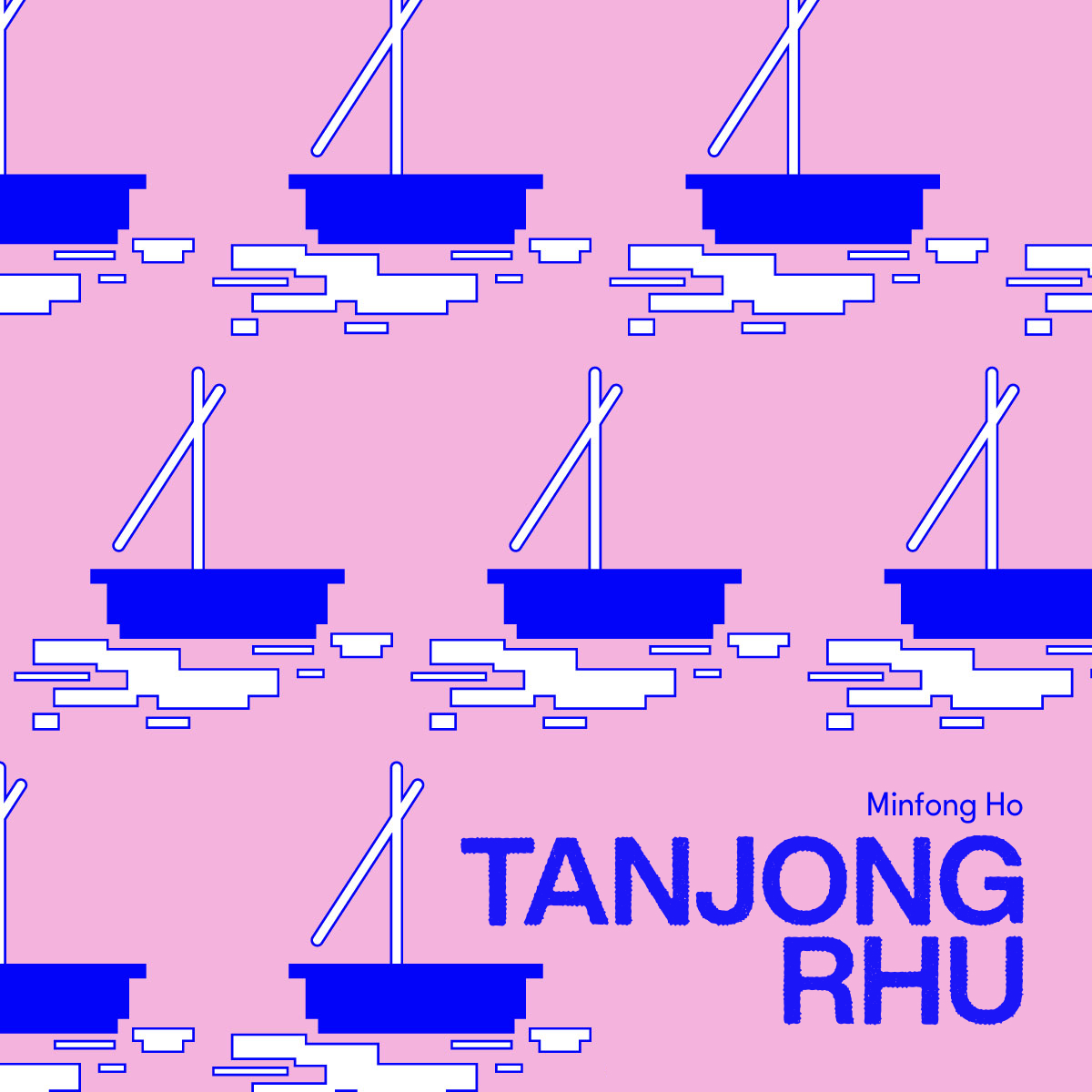
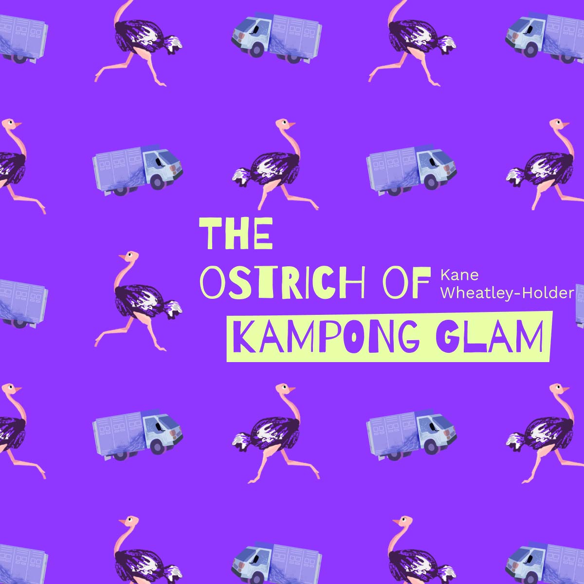
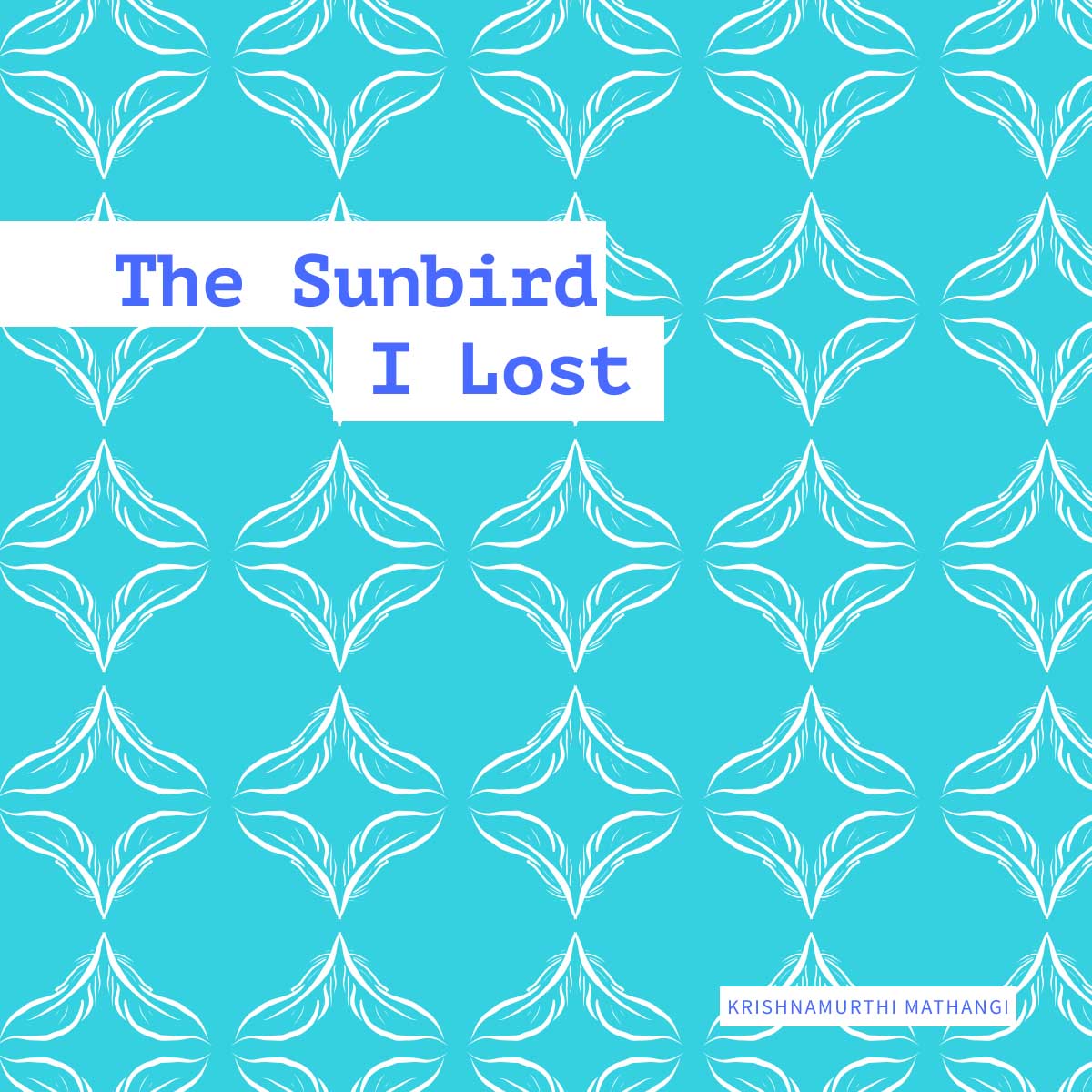
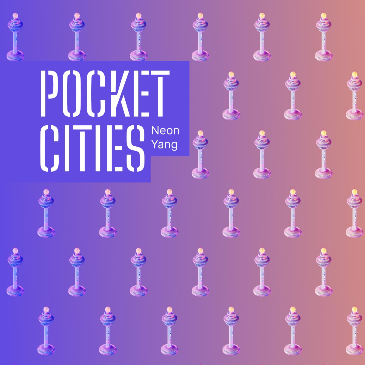
| Bespoken word: “Chinatown I”, “A Story, or History, Perhaps?”, and “The Sunbird I Lost” | Reverse reading: “Mustafa Centre. A Fact Sheet” and “Tanjong Rhu” | Google Street View story: “The Ostrich of Kampong Glam” | Expedition-type map storytelling: “Pocket CIties” |
These formats were chosen for their ability to appeal to various audiences as well as highlight the stories’ themes.
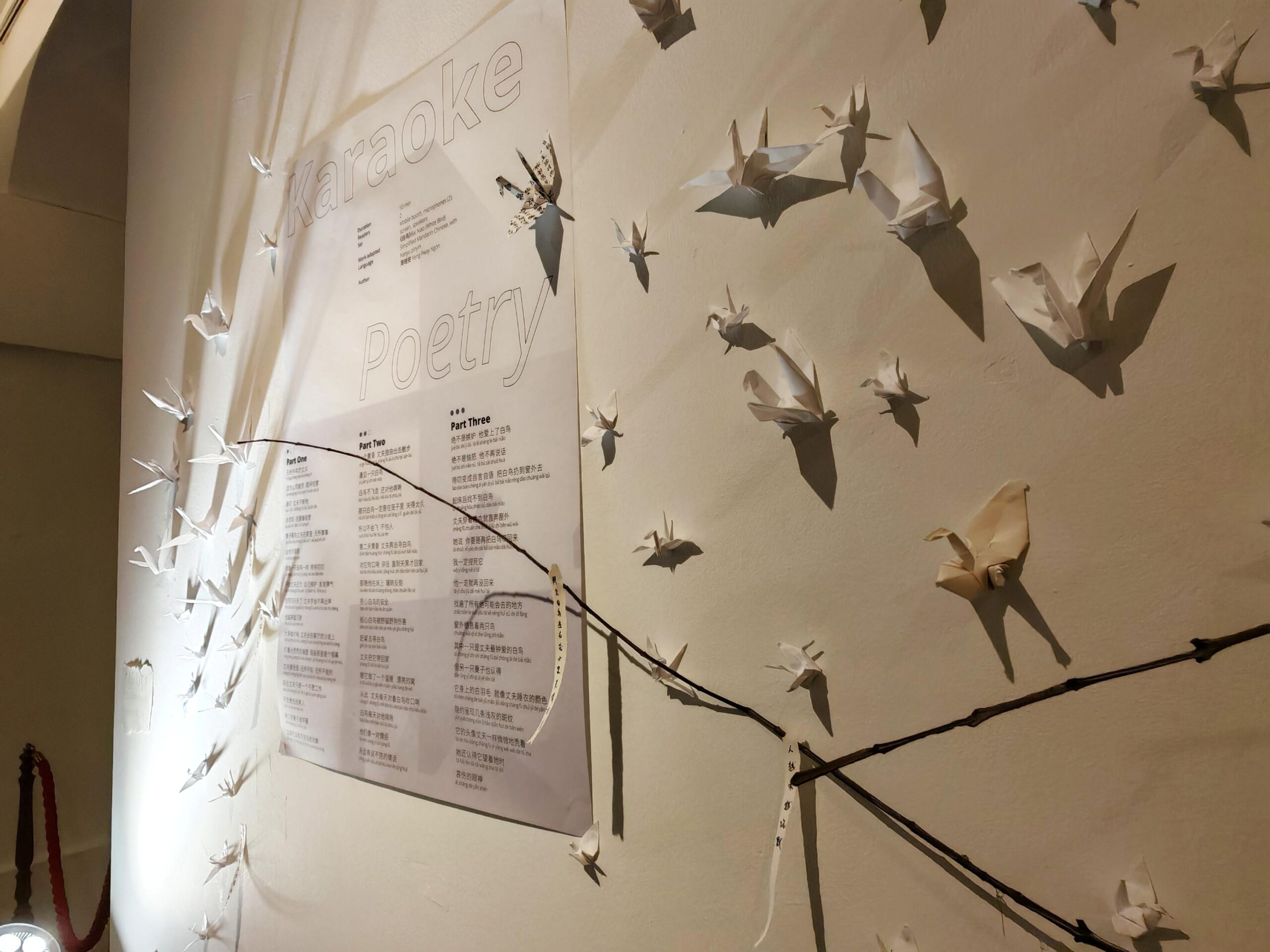
For example, “bespoken word”, a format where users match sound effects to a poetry reading, was chosen for its appeal to audiences interested in music. We used this format for three mother-tongue works in order to explore the sonic differences between languages. Read blog: little red comma – Behind the scenes (Part 2): Creating your own spoken word track
In addition, the different formats were used to highlight different themes for each story, encouraging users to think about how the digital medium can shape their interpretation of each work. Read our blog: Concepts behind little red comma works (Part 1)
Process
Researching different presentation formats
We began by researching and selecting different presentation formats that could appeal to different audiences, creatively utilised the digital medium, and were suited to the chosen works. Four presentation formats were eventually chosen: Reverse reading, bespoken word, Stories on Site, and expedition-type map storytelling.
Writing creative briefs
Due to the number of works that needed to be adapted within the timeframe, we engaged freelance illustrators, UI/UX designers, and a web developer to work on several of the microsites. We also collaborated with Artwave Studio on the audio design.
In order to facilitate communication between collaborators, we prepared detailed creative briefs. These briefs included our overall interpretation of each work, including a plot summary, key themes, and notes on mood and tone. For the design briefs, we included storyboards and visual references for the UI, as well as an annotated copy of the text with suggested sections and user interactions.
User testing
We conducted user testing for four of the microsites: “Tanjong Rhu”, “Mustafa Centre”, “The Ostrich of Kampong Glam”, and “Pocket Cities”. The intent of these sessions was to identify any confusing areas of the UI as well as whether the adaptation was successful in conveying our interpretation of the story. As one of the project’s objectives was to appeal to younger audiences, we recruited testers aged 13-24.
Based on the findings, we were able to fine-tune specific features and better understand what appealed to this demographic. This allowed us to refine our lo-fi prototypes before the final versions were published on Esplanade Offstage.
Educator’s Guides
Check out these educator’s guides for ideas on how you can use these literary works in the classroom.
For English literature and language arts learners
- A Story, or History, Perhaps? by Abdul Ghani & Chinatown, I by Tan Chee Lay
Explore the main themes of social history and urban development and consider how texts explore sociocultural practices, beliefs and values | Find out more here - Mustafa Centre. A Fact Sheet. by Pooja Nansi
Explore the use of structure, anaphora and situational irony in Mustafa Centre. A Fact Sheet. | Find out more here - Tanjong Rhu by Minfong Ho
Study the use literary devices such as motifs, irony, diction, dialogue and figurative language | Find out more here - The Ostrich of Kampong Glam by Kane Wheatley-Holder
A lesson on the use of humour and understanding character perspectives | Find out more here
For Chinese language learners
- Chinatown, I by Tan Chee Lay | Find out more here
